New! Google Analytics Premium Service

Google has introduced a newly improved analytics tool which is an extension their current Google Analytics.
Premium features include:
  • Extra processing power – increased data collection, more custom variables and downloadable, unsampled reports
  • Advanced analysis – attribution modeling tools that allow you to test different models for assigning credit to conversions
  • Service and support – experts to guide customized installation, and dedicated account management on call – all backed by 24/7 support
  • Guarantees – service level agreements for data collection, processing and reporting

Google Analytics Premium Introduction Video

Pricing

Annual plan comes at $150,000, according to Forrester analyst Joseph Stanhope.

“Is the transformation complete? It is not; at this early stage GA Premium is not a substitute for an established enterprise implementation in many cases,” Stanhope wrote in a blog post. “But it’s a huge step forward for a solid offering, and Google will continue to aggressively iterate the product to close the remaining gaps over time.”

This new premium service looks like its a great tool for large companies who are looking to expand their analytics knowledge with more than just clicks or page views but with real time data and in depth site analytics.

To learn more about it visit http://www.google.com/analytics/premium/

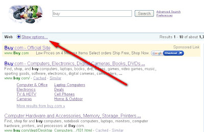
Show Options Google – Hide options Google Feature

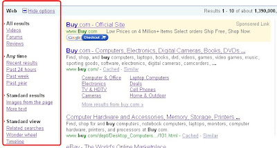
Apparently Google has added a new feature to the search engine results similar to the one shown in Google News, Google Blog Search. It seems to sort results by videos, forum, and reviews which I think is very helpful given the fact the everyone types those search terms when looking for something specific. Also it aggregates results by time such as 3 hours ago, week ago etc.. as well as by forum, reviews, videos, images. It is supposed to help the user filtering , refining and further exploring the Google search results. Overall a great feature to help people ease their search.

Google Show Option

Show Options Google - Hide options Google Feature

Google Show Option 2
Show Options Google - Hide options Google Feature

All results

  • Videos
  • Forums
  • Reviews

Any time

  • Recent results
  • Past 24 hours
  • Past week
  • Past year

Standard results

  • Images from the page
  • More text

Standard view

  • Related searches
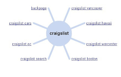
  • Wonder wheel ( Graphical representation of search resutls)
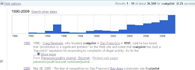
  • Timeline
Wonder wheel Gogle

Wonder wheel google

Google Timeline
Show Options Google - Hide options Google Feature

View this Video straight from Google Show Option

Google Earth Ocean View

Google Earth
new google earth ocean view

Google earth has upgraded from version 5.0, the application has become a great learning and breakthrough tool for anyone mainly now that it has added the ocean view. That is correct you can now dive in under the ocean surface and discover on your own treasures with Google earth as your personal tour guide courtesy of images and web clips from National Geographic, Discovery, Cousteau Ocean World and others.

“We’re trying to encourage our users to annotate all the places in the world. Part of what we’re doing is seeding that ecosystem of spatial information,” Hanke said. “That creates an opportunity for Google to provide location services on phones, mobile devices, in cars in the future, to guide people to the best places. Being a valued guide, the go-to source of information about the best places to go–that will be a powerful and valuable thing for Google.”

“We try to create products people love to use,” Birch said. “We create value, then think of appropriate ways of monetization.”

“But I go to the supermarket and still see the United Nations of fish for sale,” she said. “Marine sanctuaries are still not really protected. Google Earth gets all this information now and puts it in one place for the littlest kid and the stuffiest grownup to see in a way that hasn’t been possible in all preceding history.”

Personally I may not be using this tool as much but I defiantly think that people in the research field may find this tool handy.

Mozilla has created the contest

The Mozilla Foundation has used (of course) the Internet to engage its community of users around a contest that rewards the best marketing plan – but it is so generous to describe them, are structured presentations – focused on the proposed retention of users.

Indeed, one of problems faced by Firefox is not so much the number of installations, the number of people who actually use it. Because the browser is the main instrument for grated Internet users routine and non-experts need time to learn the operation. And when he reached the mastery of independence not sufficient enough curiosity browser competitor to exit the tool that is known to use.

For this reason, Mozilla has created the contest: the first phase of rough collection of ideas, presented through a slender two pages. An initial evaluation is performed by an internal team and the ideas are great. Only those who pass the screening (10) access to the next stage and can present a plan of detail about fifteen pages. And these ideas are being presented to the court of the community. The most voted will receive $ 3000 and will be implemented as part of the marketing of Firefox. Here you can find all details on the participation

The ideas are very mildly affected, structured, well even some depth. At a cost far affordability, managed to take home a wealth of ideas do not matter. Considering then that all the ideas submitted are royalty free and creative common license (regulation), to the fact the heritage of ideas collected and implemented is very high.

The reasons for success? Communty a very strong, large and cohesive, sharing not only needs but also ideal (the davide against Goliath-IE7), and a desire for notoriety, to be recognized first among equals within the same commuinty

News Google analytics admin interface

The Google analytics admin interface has changed dramatically starting from when you first log in the new admin area it will display a list of all accounts that you have access to.
This fascinating layout of all accounts is innovative and very helpful. I believe that will greatly impact the way you work by saving time and generate reports quickly and if you’re an agency, or a large company, you probably have access to multiple google analytics accounts so this is a great improvement. The new layout makes it easy to identify performance metrics at the account level.

The new key metric layouts are:

* Visits
* Time on Site
* Bounce Rate
* Completed Goals

One single feature in fact does a date comparison. If you choose one of the above bulleted metrics using the drop down at the top of the column and a simple date range using the buttons at the top right corner of the screen to determine how said metric has changed over the past day, week, month or year.

What is a Motion Chart? How do I use it?

A Motion Chart takes your Analytics graphs one step further by offering multi-dimensional analysis of all your metrics for a given report. Plotting your data into four different dimensions can help you spot unique opportunities or anomalies faster and easier.

To begin using your Motion Chart, please follow these steps:

1. Click the “Visualize” icon from any report that has a table displaying segmented data (you can always revert to the traditional graphs in your Analytics Reports by selecting a particular report from the lefthand side menu). For this example, let’s use the Keyword Report.
2. Once the Motion Chart loads, you’ll see an array of bubbles. Each bubble represents a different keyword from your report.

3. Now select the four different dimensions to plot your data: X-axis, Y-axis, Color, Size. Click on each control to see a menu of metrics you can select from. Once you select all four, point your mouse over any bubble to see the numeric value for each of them.

4. Press “Play” at the bottom of your chart to see how your keywords perform over time. If you click on a bubble and check the “Trails” box underneath the Size control, you can map out the bubble’s movement over time. ( Google analytics blog)

I had no problem with the older version at all and I like using both interface as long as the data is broken down to the core metric. The old interface allowed me to see progressive revisions of my statistics all over the day as an alternative of having to wait until the end of the day. It looks like the conversion tracking is much easier in the old version. Overall a great upgrade from the older version and we are looking forward to seeing more of google updates.
Gmail for new mobile phones

The Gmail for mobile 2.0 provides superior performance and features to receive push email on mobile phones

You are happy owners of a Gmail account? So now it is even easier and faster access from mobile phones to e-mail inbox. If you have not yet e-mail to the Google service, this could be an opportunity for dotarvi a reliable system of push email on mobile (including Java, not just smartphones).

And it’s free, because you only responsible to pay the data traffic generated on the cell line. The credit goes entirely to the new 2.0 version of Gmail for mobile clients, or small Java software that offers all the features of e-mail. In mobility: the application being installed on your mobile phone, is with your profile and is ready for use.

“We have renovated the architecture of the client to improve the functioning of the process in the background, in addition to refining the elements of the code that created bottlenecks and slowdowns,” says Derek Phillips, software engineer involved in the project Google Mobile.
Gmail for new mobile phones

And this explanation, appeared on the official blog search engine for this type of application is sufficiently clear about the new features of Gmail 2.0. In detail, was a work of profound improvement in the operation of the program, particularly for those with multiple accounts and configured for those who want to move without too many problems by mail to Google Apps.

And then a new collection of direct links and features has been dedicated to those who use Gmail 2.0 on a smartphone with a Qwerty keyboard. Plus, now the software can also operate in the background without too much resources. Even in off-line: Allows you to prepare messages, which will be sent automatically as soon as you reconnect to the network data.

Everything held together by revised menu and a custom, now with the support 35 different languages and the BlackBerry. To download Gmail for mobile 2.0 just go with your mobile browser at m.google.com / mail and download the application. There is also a video that explains in English the new features is available by

Google Reporting Separate Metrics For Search Partners

Finally Google is offering adword advertisers the option to separate the search partner report data from Google content network. This is a very helpful way to separate the traffic data since up until now its has been very hard to see where conversions were coming from as data was blended in with Google search and partners altogether.

As you can see from the screengrab below it is really neat and helpful to see the results separate which makes if very easy to analyze.
Google Reporting Separate Metrics For Search Partners

Below are some of the google search partners :

Google Reporting Separate Metrics For Search Partners

Below are some of the google content network partners :

Google Reporting Separate Metrics For Search Partners

There are many sources that Google gets its traffic from but not many people may be fully aware of this information. However, this is a great visualization for separation of metrics.